
In today's fast-paced digital ecosystem, the difference between a seamless user experience and a frustrating abandonment often comes down to milliseconds. As software systems grow increasingly distributed and asynchronous, traditional modeling approaches that focus solely on message sequencing can overlook a critical dimension: time. Understanding not just what components do, but precisely when they act and for how long, has become essential for building resilient, high-performance applications.
This case study presents a deep dive into the practical application of UML Timing Diagrams through a real-world scenario: the creation of a new regular blog account. By shifting the analytical lens from interaction order to temporal behavior, we reveal how timing diagrams illuminate state durations, expose hidden dependencies, and empower teams to architect systems that perform predictably under real-world conditions. Whether you are a product manager optimizing user onboarding, a system architect designing authentication flows, or a developer troubleshooting race conditions, this analysis provides actionable insights for leveraging temporal modeling to enhance both technical execution and user satisfaction.
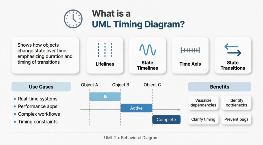
UML Timing Diagrams represent a specialized modeling tool within the Unified Modeling Language framework, designed to visualize the behavior of objects across a specific time horizon. Unlike sequence diagrams that prioritize the order of interactions, timing diagrams emphasize the temporal dimension—showing exactly how long an object remains in a particular state and when transitions between states occur. This temporal precision makes timing diagrams especially useful for:
Real-time systems where timing constraints are critical
Performance-critical applications requiring precise state management
Complex workflows with multiple interdependent components
Systems where race conditions or timing-related bugs pose significant risks
The "CreateNewRegularBlogAccount" scenario provides an ideal context for demonstrating these capabilities, as account creation involves multiple system components that must coordinate their actions within specific time windows to ensure a seamless user experience.
The timing diagram models a blog account creation workflow involving five key participants, each represented as a lifeline in the diagram:
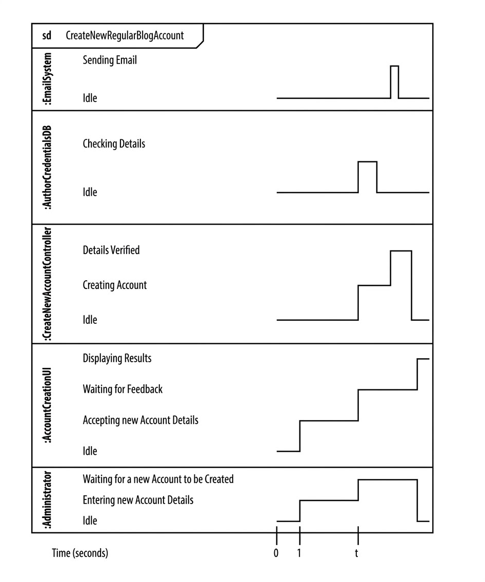
Administrator: The human actor who initiates the account creation process by entering registration details through the user interface.
AccountCreationUI: The front-end interface component responsible for capturing user input, validating form data, and presenting feedback to the user.
CreateNewAccountController: The business logic layer that orchestrates the account creation process, coordinating between the UI, database, and notification services.
AuthorCredentialsDB: The persistent storage system responsible for verifying credential uniqueness, storing new account information, and maintaining data integrity.
EmailSystem: The external service component tasked with sending confirmation emails to newly registered users.
Each participant in the diagram maintains a defined set of states that represent its operational conditions at any given moment. For instance, the EmailSystem alternates between "Idle" and "Sending Email" states, while the CreateNewAccountController transitions through states such as "Waiting for Input," "Processing Request," "Verifying Credentials," and "Account Created."
The horizontal waveforms associated with each lifeline provide a continuous visualization of state occupancy over time. Vertical shifts in these waveforms indicate state transitions, which correspond to specific events or triggers within the system. This visual representation enables stakeholders to quickly identify:
Which components are active during specific time intervals
How long each component remains in particular states
The sequential and parallel nature of system operations
Potential idle periods or unnecessary waiting states
Following the timeline from left to right reveals the precise temporal sequence of the account creation workflow:
At Time 0-1 Second: The Administrator transitions from "Idle" to "Entering new Account Details," simultaneously triggering the AccountCreationUI to move into "Accepting new Account Details" state. This initial phase represents the user interaction window where form data is collected.
At Variable Time 't': Once the user submits their details, the system enters a processing phase. The AuthorCredentialsDB briefly transitions to "Checking Details" to verify credential uniqueness, while the CreateNewAccountController moves to "Creating Account" state to orchestrate the registration logic. The variable 't' notation indicates that this transition occurs after an indeterminate but bounded processing duration, reflecting real-world variability in database response times.
Completion Phase: Only after the controller successfully reaches the "Details Verified" state does the EmailSystem transition to "Sending Email," ensuring that notification occurs exclusively upon successful account creation. This dependency relationship prevents premature or erroneous email dispatch.
The horizontal time axis, measured in seconds, provides quantitative context for evaluating system performance characteristics:
Relative Timing Markers: Specific tick marks (0, 1, t) enable precise measurement of event sequencing. Fixed markers represent deterministic transitions, while variable markers accommodate non-deterministic processing durations inherent in database operations or external service calls.
Duration Visualization: The horizontal length of each state segment directly corresponds to the time an object spends in that condition. This visual metric supports performance analysis by highlighting components that may benefit from optimization—for instance, an unusually long "Checking Details" duration might indicate database indexing opportunities.
Concurrency Identification: Parallel state segments across different lifelines reveal opportunities for concurrent processing. Components operating in parallel states can potentially be optimized through asynchronous execution patterns to improve overall system throughput.
The timing diagram incorporates several standardized elements that facilitate consistent interpretation:
Lifelines: Each classifier (e.g., :Administrator, :AccountCreationUI) appears in a dedicated horizontal row, providing clear visual separation of component responsibilities and state timelines.
State Timelines: The continuous waveform for each lifeline illustrates the "highs and lows" of object activity, enabling rapid assessment of component utilization patterns across the workflow duration.
Tick Marks: Numerical values along the X-axis (0, 1, t) serve as temporal reference points for measuring event sequencing and state duration with precision.
Transition Events: Points where state lines shift vertically represent triggers or completion signals that drive workflow progression, making causal relationships between components explicit.
Timing diagrams provide product managers with a concrete visualization of user journey timing, enabling more accurate estimation of feature delivery timelines and identification of potential user experience friction points. By understanding exactly how long each step in the account creation process takes, product teams can set realistic expectations for performance metrics and prioritize optimization efforts based on actual temporal impact.
Development teams benefit from timing diagrams through improved clarity on component dependencies and temporal constraints. The explicit representation of state durations helps identify opportunities for asynchronous processing, caching strategies, or parallel execution that can enhance system responsiveness. Additionally, timing diagrams serve as valuable documentation for onboarding new team members and maintaining institutional knowledge about system behavior.
Quality assurance professionals can leverage timing diagrams to design more effective test scenarios that account for temporal variations and edge cases. By understanding the expected duration of each state, testers can establish appropriate timeout thresholds, validate performance under load, and identify timing-related vulnerabilities such as race conditions or deadlock scenarios.
The visual nature of timing diagrams makes them effective communication tools for non-technical stakeholders. By translating complex temporal relationships into intuitive visual representations, these diagrams facilitate clearer discussions about system capabilities, limitations, and improvement opportunities across diverse audiences.
To maximize the value of timing diagrams in system design workflows, consider these implementation guidelines:
Start with Critical Paths: Focus initial timing diagram efforts on workflows where timing precision matters most—authentication flows, payment processing, or real-time collaboration features—to demonstrate immediate value.
Maintain Appropriate Granularity: Balance detail with clarity by modeling states at a level of abstraction that supports decision-making without overwhelming viewers with excessive granularity.
Integrate with Existing Workflows: Incorporate timing diagram reviews into existing design and architecture review processes to ensure temporal considerations receive appropriate attention alongside functional requirements.
Update Iteratively: Treat timing diagrams as living documents that evolve alongside the system, updating state definitions and timing estimates as performance characteristics change through optimization or scaling efforts.
Combine with Complementary Models: Use timing diagrams alongside sequence diagrams, state machines, and performance monitoring data to develop a comprehensive understanding of system behavior across multiple dimensions.
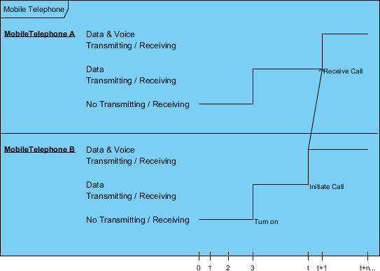
Timing diagrams are UML interaction diagrams used to show interactions when a primary purpose of the diagram is to reason about time.
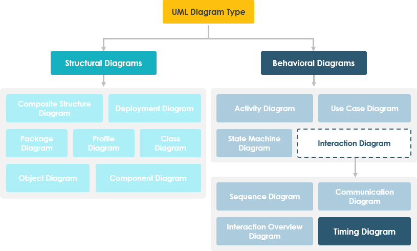
Timing diagrams focus on conditions changing within and among lifelines along a linear time axis. Timing Diagrams describe behavior of both individual classifiers and interactions of classifiers, focusing attention on time of occurrence of events causing changes in the modeled conditions of the Lifelines.
Changes from one state to another are represented by a change in the level of the lifeline. For the period of time when the object is a given state, the timeline runs parallel to that state. A change in state appears as a vertical change from one level to another. The cause of the change, as is the case in a state or sequence diagram, is the receipt of a message, an event that causes a change, a condition within the system, or even just the passage of time.
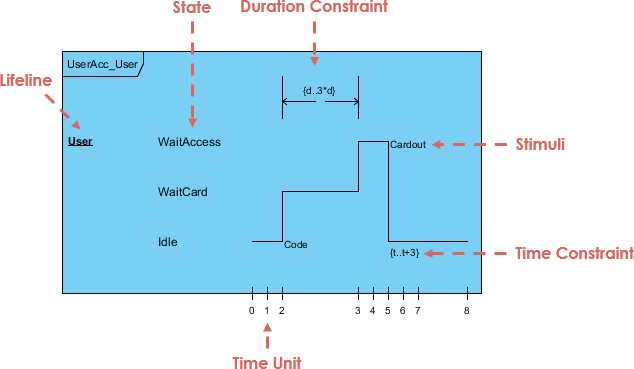
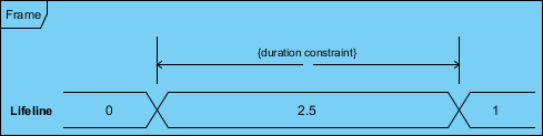
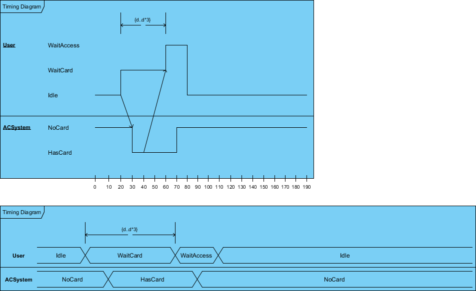
The figure below shows an alternative notation of UML Timing diagram. It shows the state of the object between two horizontal lines that cross with each other each time the state changes.
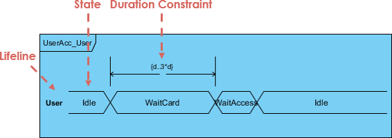
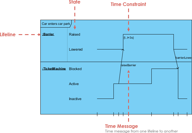
Major elements of timing UML diagram - lifeline, timeline, state or condition, message, duration constraint, timing ruler.
A lifeline in a Timing diagram forms a rectangular space within the content area of a frame. Lifeline is a named element which represents an individual participant in the interaction. It is typically aligned horizontally to read from left to right.
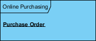
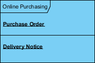
Multiple lifelines may be stacked within the same frame to model the interaction between them.
A state or condition timeline represents the set of valid states and time. The states are stacked on the left margin of the lifeline from top to bottom.
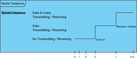
The cause of the change, as is the case in a state or sequence diagram, is the receipt of a message, an event that causes a change, a condition within the system, or even just the passage of time.
It is possible to stack several life lines of different objects in the same timing diagram. One life line above the other. Messages sent from one object to another can be depicted using simple arrows. The start and the end points of each arrow indicate when each message was sent and when it was received.
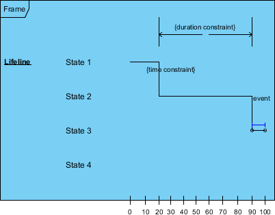
A state lifeline shows the change of state of an item over time. The X-axis displays elapsed time in whatever units are chosen while the Y-axis is labelled with a given list of states. A state lifeline is shown below:
A value lifeline shows the change of value of an item over time. The X-axis displays elapsed time in whatever units are chosen, the same as for the state lifeline. The value is shown between the pair of horizontal lines which crosses over at each change in value.
We can use the length of a timeline to indicate how long the object remains in a particular state by reading it from left to right. To associate time measurements, you show tick marks online the bottom part of the frame.
The example below shows that the Login event is received three time units after the start of the sequence. To show relative times, you can mark a specific instance in time using a variable name. The figure marks the time the sendMail event is received as time.
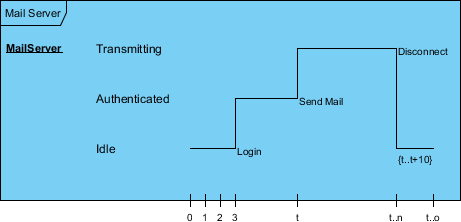
You can use relative time marks in constraints to indicate that a message must be received within a specified amount of time.
State and Value Lifelines can be put one after the other in any combination. Messages can be passed from one lifeline to another. Each state or value transition can have a defined event, a time constraint which indicates when an event must occur, and a duration constraint which indicates how long a state or value must be in effect for.
Timing diagram should always be consistent with the relevant sequence diagram and state machine. To do this we can attach states in the lifeline for each of the objects in the sequence diagram. We can then derive the corresponding timing diagram much easier by inspecting the message passing between the objects against the states attached in the lifeline. The Carpark example below shows the model consistency between two interaction diagrams.
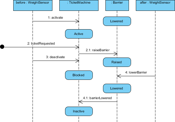
The figure above shows a sequence diagram of the car park example, while the figure below presents the corresponding timing diagram of the car park example. The various parts of the timing diagram refer to the content of sequence diagram.
UML Timing Diagrams offer a powerful yet underutilized perspective for modeling system behavior, particularly in scenarios where temporal precision and state management are critical to success. Through the "CreateNewRegularBlogAccount" case study, we have demonstrated how timing diagrams can clarify the temporal relationships between system components, identify performance optimization opportunities, and support more informed architectural decisions. By shifting focus from message sequencing to state duration, timing diagrams complement existing modeling approaches and provide unique insights that enhance both technical implementation and stakeholder communication.
For organizations developing user-facing applications with complex workflows, adopting timing diagrams as part of the design toolkit can yield significant benefits: improved system reliability through better understanding of temporal dependencies, enhanced user experience through optimized response times, and more effective collaboration through clear visualization of system behavior. As software systems continue to grow in complexity and user expectations for performance continue to rise, the ability to model and reason about time becomes increasingly valuable. Timing diagrams provide a structured, visual approach to mastering this dimension of system design, enabling teams to build applications that are not only functionally correct but also temporally robust.
By integrating timing diagram analysis into standard development practices, teams can proactively address timing-related challenges, optimize critical workflows, and deliver systems that perform predictably under real-world conditions. The investment in learning and applying this modeling technique pays dividends through reduced debugging time, more accurate performance forecasting, and ultimately, higher quality software that meets both functional and temporal requirements. In an era where milliseconds shape user perception and system resilience, mastering temporal logic through UML Timing Diagrams is not just a technical advantage—it is a strategic imperative.

