Introduction
In Agile project management—whether you are using Scrum, Kanban, or a hybrid framework—data and visibility are the lifeblood of continuous improvement. Metrics and visual tools are not designed to micromanage or punish teams; rather, they serve as a compass. They provide transparency, highlight bottlenecks, enable accurate forecasting, and foster a shared understanding of the team’s health and progress.
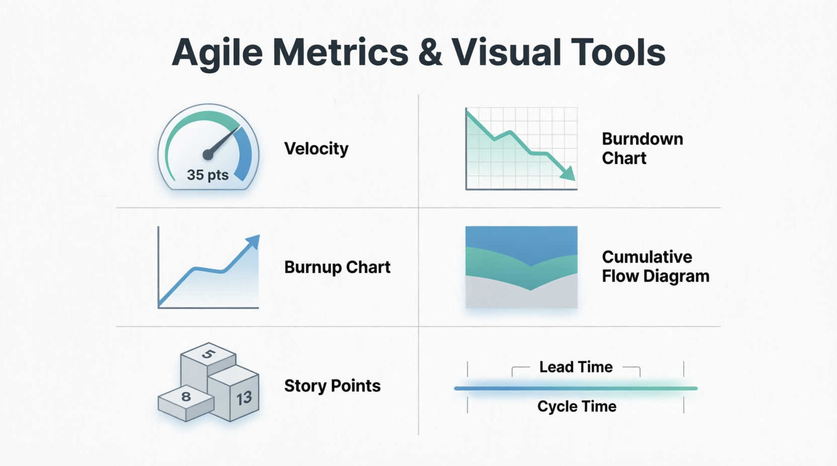
This comprehensive guide breaks down six foundational Agile metrics and visual tools: Velocity, Burndown Charts, Burnup Charts, Cumulative Flow Diagrams (CFD), Story Points, and Lead Time / Cycle Time. Each concept is explained in detail and accompanied by multiple real-world examples to ensure you can apply them effectively in your own projects.
1. Velocity
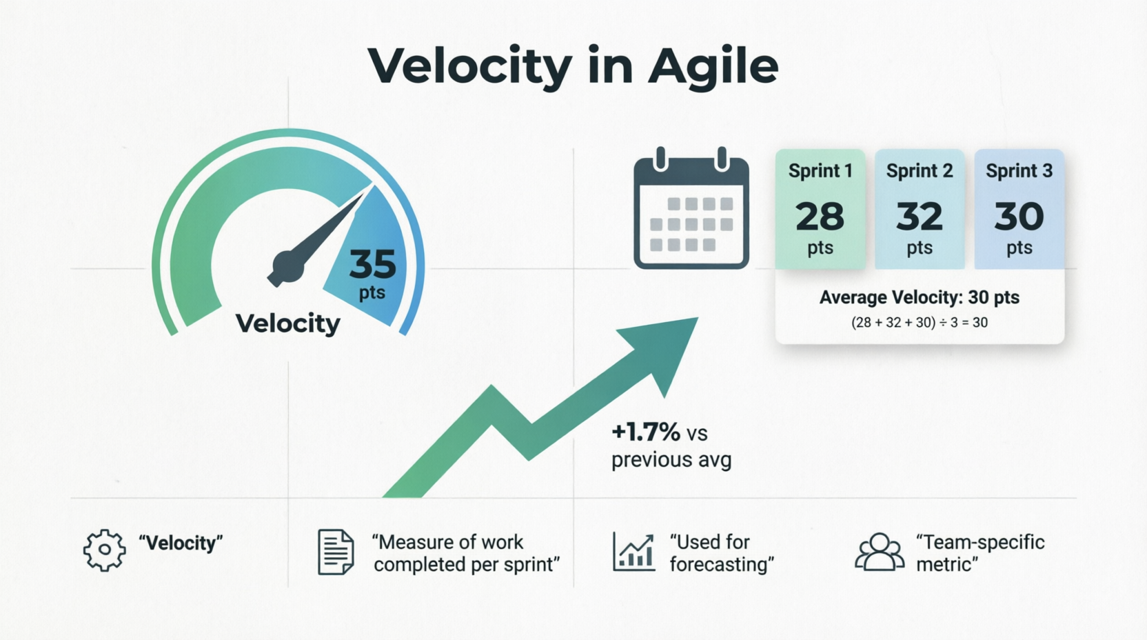
Definition: Velocity is a measure of the amount of work a team successfully completes during a single sprint, typically measured in story points or hours. It is a historical metric used to forecast how much work the team can realistically handle in future sprints.
Key Characteristics:
- It is a team-specific metric (velocities cannot be compared across different teams).
- It is calculated as an average over several sprints to smooth out anomalies.
- It helps in long-term release planning.
Examples:
- The Stable Team: A software development team completes 28, 32, and 30 story points in their last three sprints. Their average velocity is 30 points. For the next sprint planning, the Product Owner knows not to pull in more than ~30 points of work.
- The Ramping-Up Team: A newly formed team completes 15 points in Sprint 1, 22 points in Sprint 2, and 28 points in Sprint 3. Their velocity is trending upward as they overcome initial setup hurdles and improve their collaboration.
- The Impacted Sprint: A team with a normal velocity of 40 points only completes 20 points in a sprint because two senior developers were out on unexpected medical leave. The Scrum Master notes this anomaly and does not let it drastically skew the long-term average velocity.
2. Burndown Chart
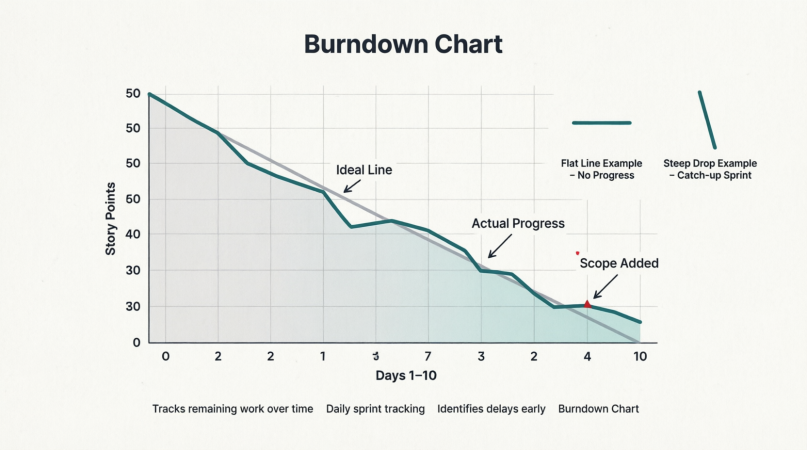
Definition: A Burndown Chart is a graphical representation of work left to do versus time. The vertical axis represents the remaining effort (e.g., story points or hours), and the horizontal axis represents time (e.g., days of the sprint). It typically features an "ideal" burndown line and an "actual" burndown line.
Key Characteristics:
- Excellent for daily sprint tracking.
- Helps the team identify early if they are falling behind.
- A flat line indicates no work is being completed; a steep drop indicates a large chunk of work was finished.
Examples:
- The Ideal Scenario: A 10-day sprint starts with 50 story points. The ideal line slopes steadily down to zero on Day 10. The actual line hovers closely around the ideal line, indicating the team is pacing themselves perfectly.
- The Late Testing Bottleneck: The actual line stays flat for the first 7 days (developers are coding but not closing tickets), then drops vertically on Days 8 and 9. This visualizes a common anti-pattern: work isn't considered "done" until the very end of the sprint, creating a last-minute QA crunch.
- The Mid-Sprint Scope Addition: On Day 4, the actual line suddenly jumps upward. Upon investigation, the team discovers the Product Owner added 10 new story points mid-sprint. The chart visually exposes this scope creep, prompting a conversation about sprint goals.
3. Burnup Chart
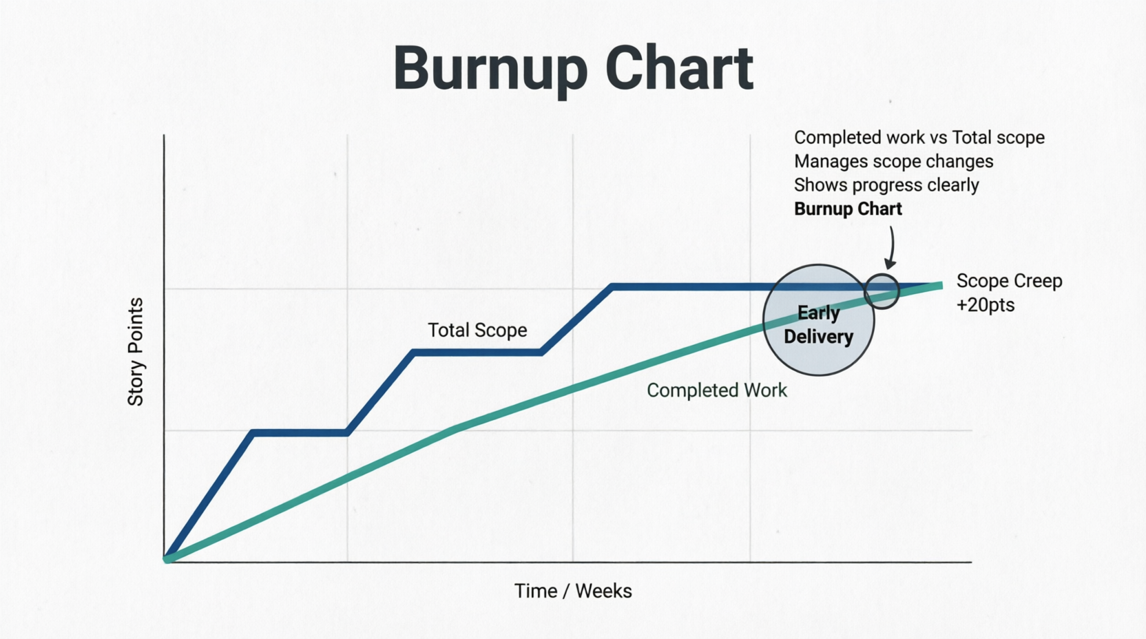
Definition: A Burnup Chart tracks completed work against the total project scope over time. Unlike the Burndown Chart, it has two distinct lines: one for Total Scope and one for Completed Work.
Key Characteristics:
- Superior to burndown charts for long-term projects or when scope is highly volatile.
- Clearly separates "we are working slowly" from "the scope keeps growing."
- Motivates teams by showing the upward trajectory of completed work.
Examples:
- Managing Scope Creep: The "Completed Work" line is rising steadily, but the "Total Scope" line suddenly jumps up by 20 points in Week 3. The burnup chart makes it immediately obvious to stakeholders that the project deadline might slip not because the team is slow, but because the goalposts moved.
- Early Delivery: A team is working on a 100-point epic. By Week 6, the "Completed Work" line intersects the "Total Scope" line. The project is delivered ahead of schedule, which is highly visible and celebratory on a burnup chart.
- Scope Reduction: The "Total Scope" line drops downward on Day 10 because the Product Owner realized a set of features was no longer necessary. The burnup chart clearly shows the team now has less work to do to reach the finish line, adjusting the projected completion date earlier.
4. Cumulative Flow Diagram (CFD)
Definition: A Cumulative Flow Diagram is an area chart that visualizes the quantity of work in various states of a workflow (e.g., To Do, In Progress, Review, Done) over time. It is a cornerstone metric in Kanban but is highly useful in Scrum as well.
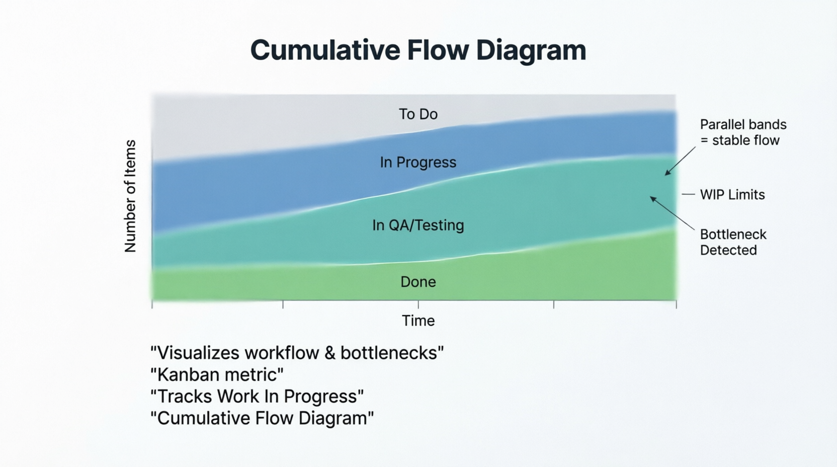
Key Characteristics:
- The vertical distance between bands represents Work In Progress (WIP).
- The horizontal distance between bands represents Lead/Cycle Time.
- Parallel bands indicate a stable, predictable flow.
Examples:
- The QA Bottleneck: The band representing "In QA / Testing" begins to widen significantly over a two-week period, while the "Done" band grows very slowly. This visually screams that the team needs to swarm on testing or that more QA resources are required.
- Healthy Flow: The bands for "To Do," "In Progress," and "Done" are roughly parallel and maintain a consistent width. This indicates that work is entering and leaving the system at a stable, predictable rate.
- Enforcing WIP Limits: A team sets a WIP limit of 3 for the "In Progress" column. On the CFD, the "In Progress" band never exceeds a vertical height of 3 items. If a new task is started, an old one must be finished first, keeping the band flat and preventing multitasking.
5. Story Points
Definition: Story points are a unit of measure used in Agile to express the relative effort, complexity, and risk/uncertainty required to complete a user story. Teams often use the Fibonacci sequence (1, 2, 3, 5, 8, 13, 21...) to prevent false precision.
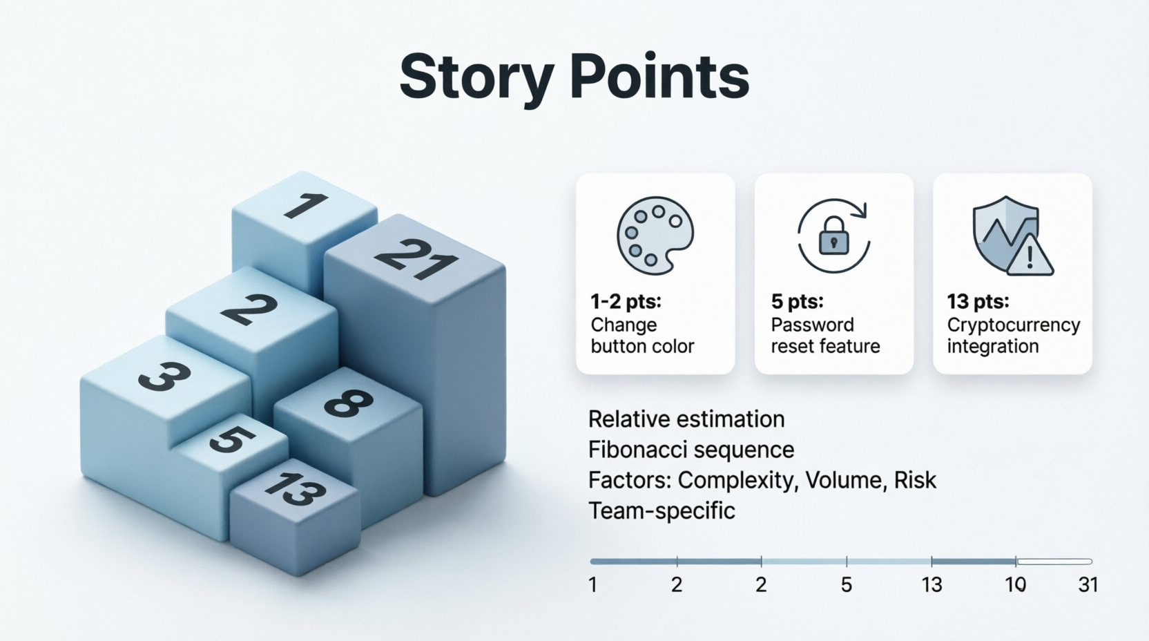
Key Characteristics:
- They are relative, not absolute (a 5-point story is roughly twice as hard as a 2-point story).
- They account for three factors: Volume of work, Complexity, and Risk/Uncertainty.
- They are team-specific; a "3" for Team A might be an "8" for Team B.
Examples:
- The Baseline (1-2 Points): "As a user, I want to change the color of the 'Submit' button from blue to green." This is a simple, low-risk, low-complexity task. It is estimated at 1 or 2 points.
- The Moderate Task (5 Points): "As a user, I want to reset my password via an email link." This requires frontend changes, backend logic, email service integration, and database updates. It has moderate complexity and is estimated at 5 points.
- The High-Uncertainty Task (13 Points): "As a user, I want to pay using a new, undocumented third-party cryptocurrency gateway." The team has never done this, the API documentation is sparse, and security risks are high. Even if the actual code is short, the uncertainty pushes this to 13 points, signaling it should be broken down or spiked (researched) first.
6. Lead Time and Cycle Time

Definition:
- Lead Time: The total time elapsed from the moment a request is made (e.g., a ticket is created in the backlog) until the work is fully delivered to the customer.
- Cycle Time: The time elapsed from the moment the team actually starts working on the item until it is completed and delivered.
Key Characteristics:
- Lead Time is a customer-centric metric (how long do they wait?).
- Cycle Time is a team-centric metric (how fast do we work?).
- Reducing the gap between Lead Time and Cycle Time means reducing the time items sit idle in the backlog.
Examples:
- The IT Support Ticket:
- Monday 9:00 AM: User submits a ticket for a broken monitor. (Lead Time starts)
- Tuesday 2:00 PM: IT technician begins diagnosing the issue. (Cycle Time starts)
- Tuesday 4:00 PM: Monitor is replaced and ticket is closed.
- Result: Lead Time = ~31 hours. Cycle Time = 2 hours. The bottleneck was the wait time in the queue, not the actual repair.
- The E-Commerce Feature:
- June 1: Product Owner writes a user story for a "Wishlist" feature. (Lead Time starts)
- June 15: Sprint begins, and developers pull the story into "In Progress." (Cycle Time starts)
- June 22: Feature is coded, tested, and deployed to production.
- Result: Lead Time = 21 days. Cycle Time = 7 days.
- The Urgent Bug Fix:
- 10:00 AM: Critical production bug is reported. (Lead Time starts)
- 10:05 AM: Developer immediately starts working on it. (Cycle Time starts)
- 11:30 AM: Fix is deployed.
- Result: Lead Time = 1.5 hours. Cycle Time = 1 hour 25 minutes. Because the item bypassed the backlog queue, Lead Time and Cycle Time are nearly identical.
Conclusion
Metrics and visual tools are the foundation of an empirical, data-driven Agile process. Velocity helps you plan realistically; Burndown and Burnup charts keep you honest about daily progress and scope changes; the Cumulative Flow Diagram exposes hidden bottlenecks in your workflow; Story Points allow for nuanced, relative estimation; and Lead/Cycle Time measure your true efficiency from the customer's and the team's perspectives.
However, a crucial caveat remains: Metrics are a compass, not a whip. They should never be used to compare teams, punish individuals, or enforce unrealistic deadlines. When used collaboratively and transparently, these tools empower teams to inspect their processes, adapt to challenges, and continuously deliver higher value to their customers. By mastering these concepts, you transform your team from a group that simply "does work" into a high-performing engine of predictable, continuous delivery.