PERT and Gantt charts are visualization tools that are often used in project management. Both of these charts are used for task scheduling, controlling, and administering the tasks necessary for the completion of a project. The difference between them is that a PERT chart is a kind of network diagram, while a Gantt chart is a bar chart.
PERT Chart is an acronym for (Program Evaluation and Review Technique). A PERT chart is a project management tool used to schedule, organize, and coordinate tasks within a project. It is a method to analyze the tasks involved in completing a given project, especially the time needed to complete each task and to identify the minimum time needed to complete the total project.
A Gantt chart is a type of horizontal bar chart commonly used in project management, which is a visual view of tasks scheduled overtime. It provides a graphical visualization of a schedule that helps to plan, coordinate, and track specific tasks (or elements) in a project.
Gantt chart boils down multiple tasks and timelines into a single page. Using a Gantt chart allows all stakeholders to perceive the same schedule information, sets mutually understood expectations, and conducts their efforts according to the desired protocol. The Gantt chart tool provides a visual timeline for the start and end of tasks, making it clear how tasks are interrelated and perhaps rely on the completion of another before one can start.

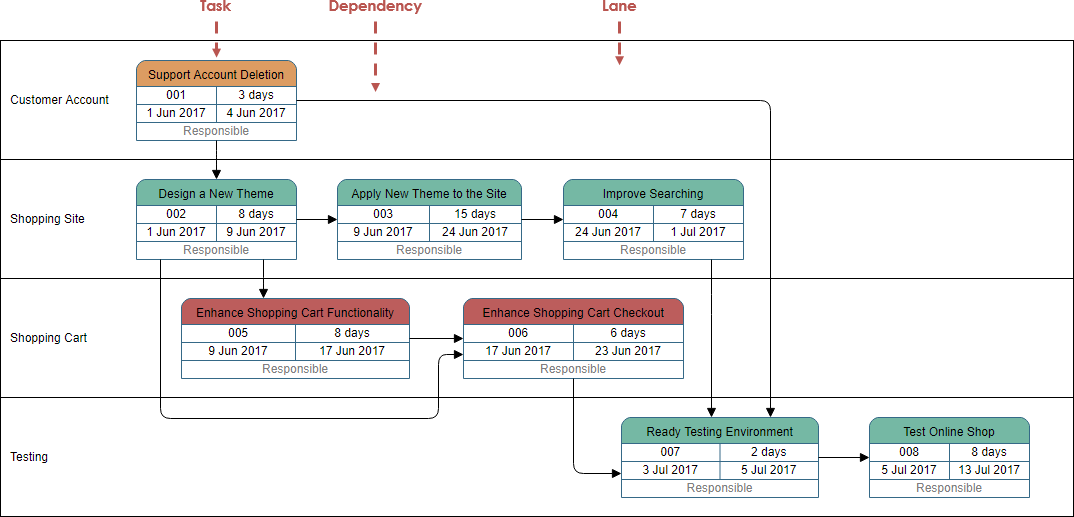
PERT charts are network diagrams that use boxes to represent tasks and arrows to present dependencies between tasks. The boxes are laid out from left to right, but there is no fixed Y-axis with dates. The first box, or root, is centered vertically on the left side, and the subsequent tasks can be drawn anywhere along the Y-axis. Arrows can point to the right, up or down, but never to the left.
Gantt charts are bar graphs. The X-axis contains dates and the Y-axis lists separate tasks. On each line of the Y-axis, the chart depicts a bar positioned to extend from the task's start date to its end date. Tasks are listed in the start-date order.
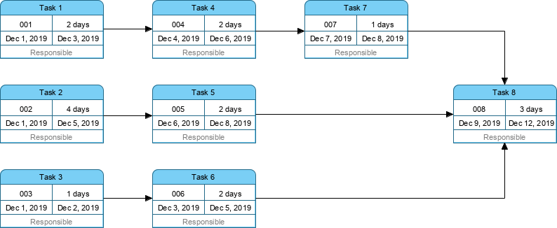
A Pert Chart:
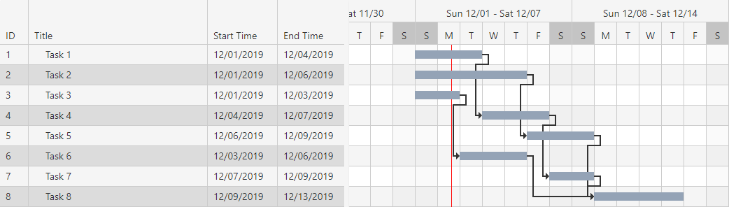
The ‘Gantt Chart version” of the PERT Chart above:
Because the PERT Chart clearly illustrates task dependencies, a PERT chart sometimes is preferred over the Gantt chart (another popular project management charting). While the PERT chart can be harder to interpret, especially for large-scale projects. Most often, project managers use both techniques in order to serve multiple purposes.
On the contrary, a Gantt chart does not show clear dependencies or relationships between tasks and also fails to provide enough information for showing the critical path and as well as the detail information for each of the activities.
We can summarize the differences between the two as listed in the table below:
| Gantt chart | PERT chart |
| Gantt chart is defined as the bar chart. | PERT chart is similar to a network diagram |
| Gantt chart was developed by Henry L. Gantt. | PERT chart was developed by the United States navy. |
| Gantt chart is often used for Small Projects | PERT chart can be used for large and complex Projects |
| Gantt chart focuses on the time required to complete a task | PERT chart focuses on the dependency of relationships. |
| Gantt chart is simpler and more straightforward | PERT chart could be sometimes confusing and complex but can be used for visualizing critical path |