AI-Powered KPI Performance Diagram Builder

Transform your business strategy from a spreadsheet into a dynamic, insightful, and actionable visual map.

  • AI-Powered KPI Performance Diagram
  • AI-Powered KPI Performance Diagram
  • AI-Powered KPI Performance Diagram

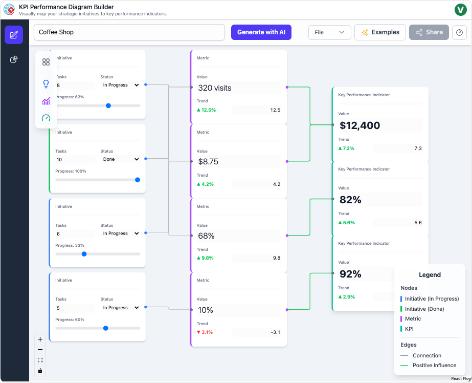
The AI-Powered KPI Performance Diagram is a dynamic web application for visually mapping, analyzing, and strategizing business performance. With an intuitive drag-and-drop canvas, business strategists, project managers, and data analysts can connect Initiatives, Metrics, and KPIs to show their interdependencies and drive impactful decision-making.

Purpose and Benefits

Instantly clarify strategic cause-and-effect using interactive, editable diagrams. Automate planning and report generation with the latest AI models to unlock new insights and accelerate performance.

  • AI-Generated Diagrams: Enter a business domain and auto-create a complete, relevant KPI flow map with logical connections.
  • Intelligent Suggestions: Select any initiative and let the AI propose high-impact metrics to add and connect, speeding planning.
  • Advanced Insights Suite: Use specialized views for executive summaries, performance deep-dives, risk analysis, and strategic recommendations-all auto-generated from your diagram.
  • Flexible AI Models: Switch between algorithms (e.g., Gemini, GPT) for custom analytical style.
  • Effortless Editing: Add, delete, link, and edit nodes with instant canvas interaction and auto-layout for optimal clarity.
  • Ready for Sharing: Save diagrams in a secure database, load them anytime, export as PNG/JSON, and share view links instantly.

How It Works: Step-by-Step Guide

The AI-Powered KPI Performance Diagram guides you through rapid visual mapping, deep analytics, and seamless sharing-all powered by advanced AI.

Step 1: Generate or Build Your Diagram

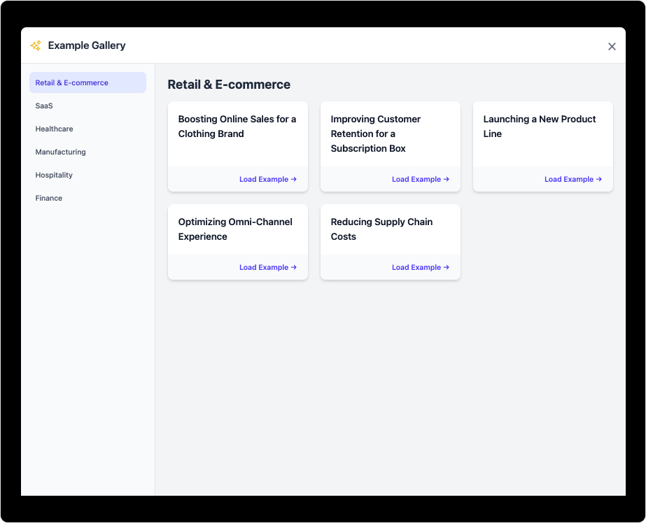
Create new diagrams by entering your business model or start manually with drag-and-drop nodes for Initiatives, Metrics, and KPIs.

  • AI Initialization: Enter a domain and let AI generate a complete performance structure.
  • Manual Canvas: Add and connect nodes to fit your specific scenario.

Step 2: Add, Connect, and Edit Nodes

Select nodes to edit data directly or link them together to map out cause-effect relationships.

  • Edit Details: Change node names, add descriptions or weights, and organize connections.
  • AI Suggestions: Use AI to recommend and auto-link relevant metrics and KPIs based on context.

Step 3: Analyze with AI Insights Suite

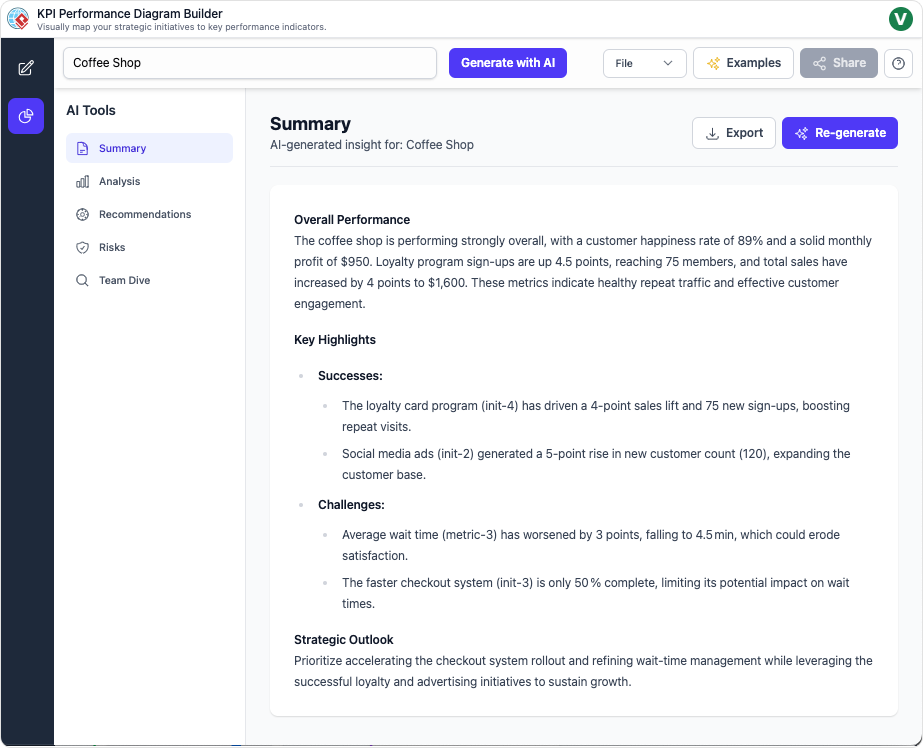
Switch to the Insights dashboard for instant, tailored reporting and recommendations.

  • Executive Summary: Get automated top-level overview for stakeholders.
  • Performance Analysis: Detailed breakouts and bottleneck detection.
  • Strategic & Risk Reports: Actionable improvement and threat identification.
  • Team Deep-Dive: Focus on single initiatives and their impacts.

Step 4: Save, Export, and Share

Preserve your work for future editing and distribute results with ease.

  • Cloud Storage: Securely save and reload diagrams from the database.
  • Export Files: Download as PNG, JSON, or other formats.
  • Shareable Links: Instantly create read-only URLs for stakeholder collaboration.

Use Cases

  • Business Leaders: Visualize how strategic actions drive bottom-line results.
  • Project Managers: Connect benchmarks, initiatives, and KPIs for transparent progress tracking.
  • Analysts: Uncover hidden dependencies and bottlenecks for more informed recommendations.

Tips & Best Practices

  • Group related nodes visually for easier reading and management.
  • Use AI suggestions to discover non-obvious links or root causes.
  • Regularly export diagrams for documentation and cross-team review.

Turn every software project into a successful one.

We use cookies to offer you a better experience. By visiting our website, you agree to the use of cookies as described in our Cookie Policy.

OK